So here I sit, 9 days away from my new album hitting digital shelves, finally ready to take a pause. The songs are shipped off, I have updated the various locations I need to update and I can now sit and breath and take a pause, that is, if I didn’t have to tell you about the super cool CD cover I designed for the new album, Pause.
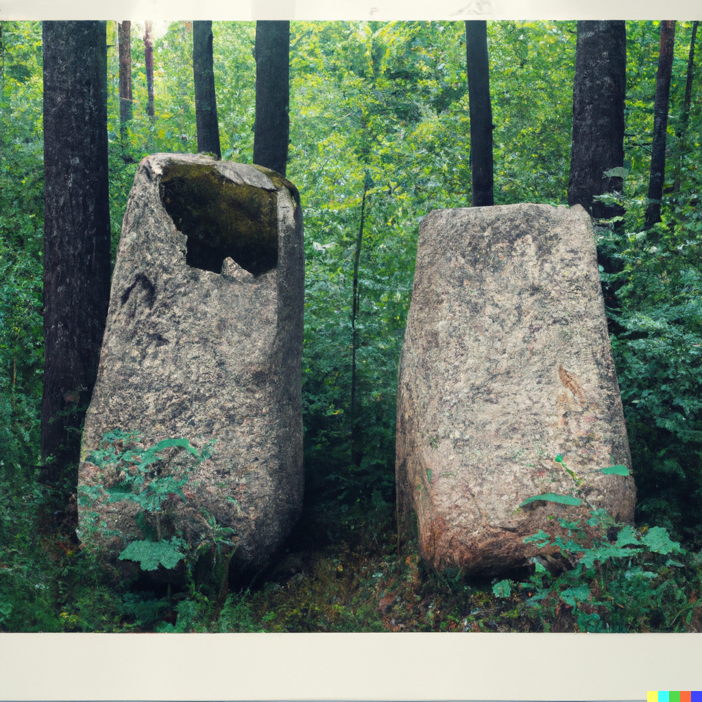
So why Pause? I decided on this title about a year a go, I think, when I noticed that a good portion of my tracks had some sort of rest or pause in them and it hit me that “pause” would be a good name for the album. I played around a bit with DALL-E for some ideas and I had one idea that I really liked (pictured below), but as I learned more about AI generative art and how they are not respecting artist’s intellectual property, I decided to ditch that idea, both out of respect and fear of legal retribution (dear unknown artist, if you feel the image below infringed on your art, please let me know and I will give credit or remove it).
So after ditching AI, I sought out some public domain art on the site Artvee.com. If you are not aware of this site, it is great for finding public domain artwork. I was seeking out something with two people looking off in the distance, but the image I found in the end offered me so much more.
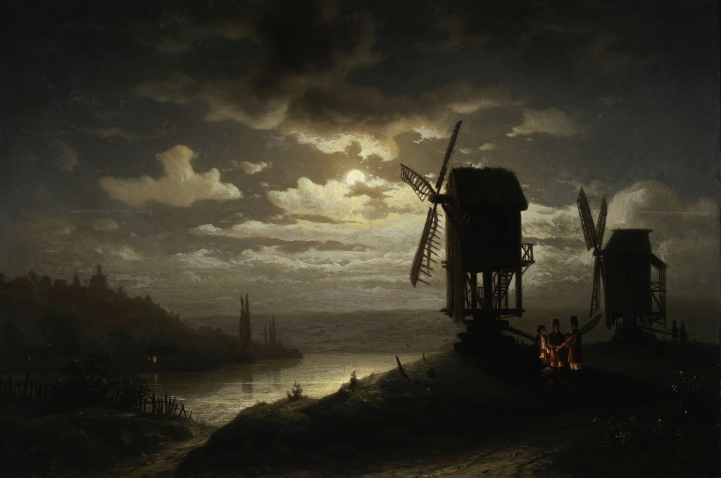
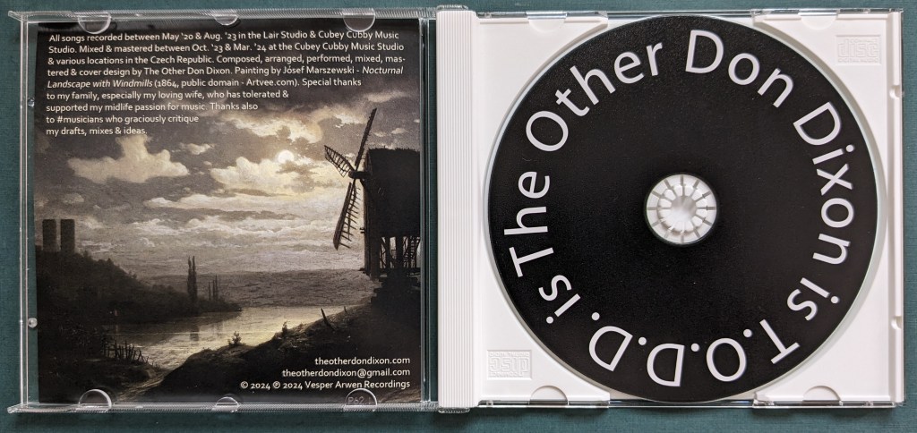
Below, you can see the painting that I selected by Jósef Marszewski titled Nocturnal Landscape with Windmills (1864). I have always been a fan of Baroque art, with dark backgrounds and illuminated subject matter, so this painting caught my eye pretty quickly. While not a true Baroque work of art, it does have the spirit of one, I think.
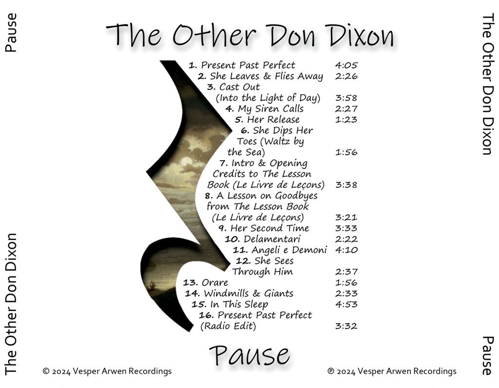
So let’s delve into what I really thought I could use from this painting. First of all, we have two windmills that are in a paused state and 2 is a very important number for this album because it is the 2nd album by The Other Don Dixon. You can see the same thing just to the right of the windmills with 2 people in a paused state looking out in the distance. So taking these elements from the painting, I came up with this for the front cover:
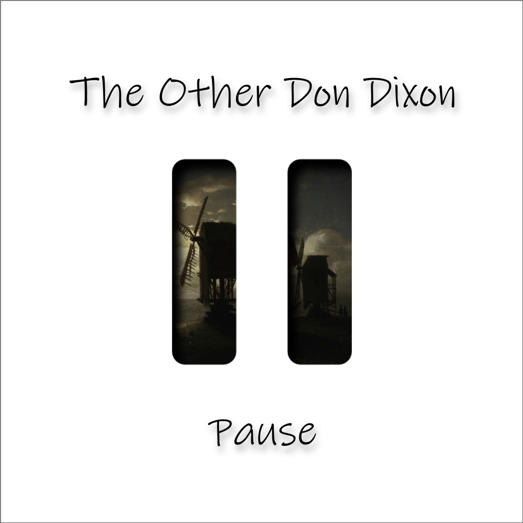
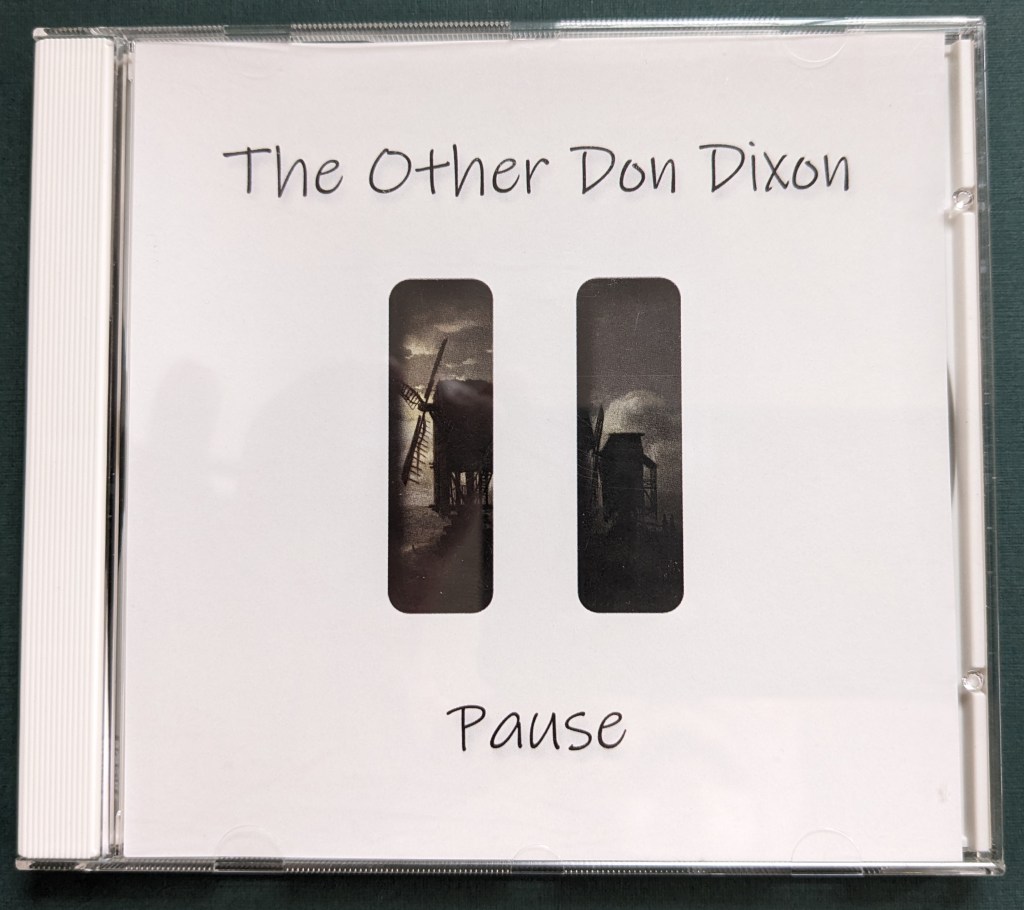
So here is where the layering comes into play. The first layer has the obvious “pause” symbol that we are all familiar with from various media players, but there is more to it than that because the pause symbol is like a Roman numeral 2 (II). Then as you look through the pause window, you can see the 2 windmills in a paused state and the two people in a paused state. Now let’s flip it over to see the inside cover:
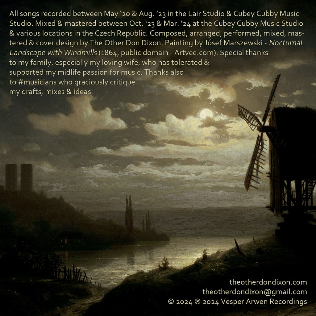
On the inside cover, I featured the left side of the painting, which shows the windmill in a paused state, but I Photoshopped in 2 monolithic towers in the background to mimic a pause symbol. A lot of people I have shown this to have missed this detail, which is subtle, but it reminds me of the small details you used to find in album covers in the past.
For the back of the CD, also known as the tray card, I presented a listing of songs, but this time to represent the idea of pause, I used music notation and the “rest” symbol, which brings us full circle to the idea behind the title itself.
I guess a valid question at this point is did I print any CDs? The answer to that is, yes, a very small run for family and friends. If you are interested in purchasing one, feel free to inquire.
Thanks for taking the time to go deeper into my new CD cover.
